

Tất cả bài viết | CSS3


Hướng dẫn tạo trang trình bày sản phẩm bằng Bootstrap với hiệu ứng CSS3
Trong bài thực hành này các Bạn sẽ được hướng dẫn tạo trang trình bày sản phẩm bằng Bootstrap với hiệu ứng CSS3
Bước 1: Dùng HTML chèn các sản phẩm
Hướng dẫn tạo trang trình bày sản phẩm bằng Bootstrap với hiệu ứng CSS3
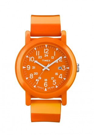
Sản phẩm 1
hocwebgiare.com nơi đào tạo thiết kế web chuyên sâu với chất lượng được cam kết cụ thể...
Mua
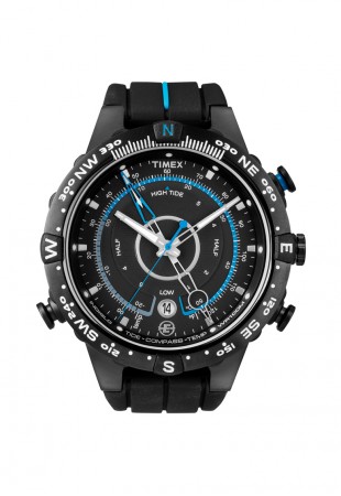
Sản phẩm 2
hocwebgiare.com nơi đào tạo thiết kế web chuyên sâu với chất lượng được cam kết cụ thể...
Mua
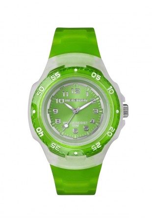
Sản phẩm 3
hocwebgiare.com nơi đào tạo thiết kế web chuyên sâu với chất lượng được cam kết cụ thể...
Mua
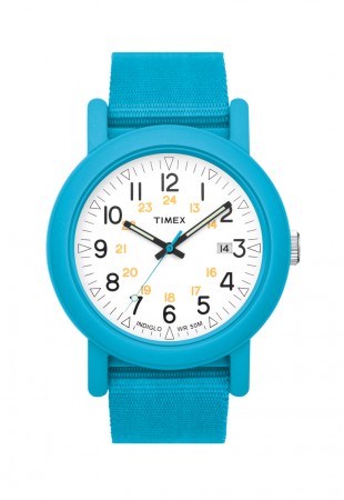
Sản phẩm 4
hocwebgiare.com nơi đào tạo thiết kế web chuyên sâu với chất lượng được cam kết cụ thể...
Mua
Bước 2: Định nghĩa CSS cho sản phẩm
Bước 3: Gọi thư viện Bootstrap
Bước 4: Gọi thư viện JQUERY
CSS3 Xem (6750) Học thiết kế web giá rẻ


