

Tất cả bài viết | Bootstrap


Hướng dẫn cách tạo Flexible Bootstrap Carousel
Trong bài Học lập trình web này các Bạn sẽ được Hướng dẫn cách tạo Flexible Bootstrap Carousel cho website.
Bước 1: Tạo cấu trúc HTML
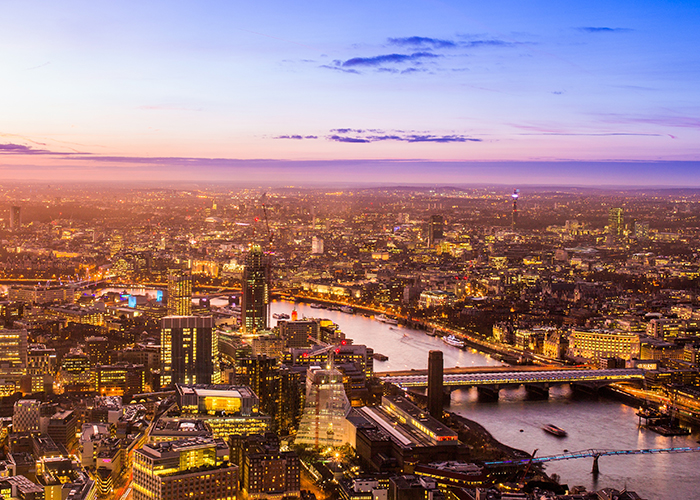
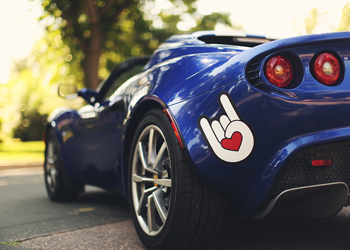
Flexible Bootstrap Carousel
Bước 2: Tạo cấu trúc CSS
body {
	font-family: 'Roboto', sans-serif;
	font-weight: 400;
	background-color: #fff;
}

	h1 {
	margin-top: 40px;
	font-family: 'Caveat Brush', cursive;
	font-size: 70px;
	text-align: center;
}

	h2 {
	margin-bottom: 25px;
	max-width: 80%;
	font-size: 32px;
	font-weight: 500;
}

	.link {		margin-top: 40px;	}
	p {		font-size: 20px;	}

.left {		text-align: left;	}
	.right {		text-align: right;	}
	.center {		text-align: center;	}

a {			}
.carousel-example {		padding: 20px 0 50px 0;	}
	.carousel.flexible .items {		display: none;	}

	#complicated-content-carousel .carousel-control {
	position: absolute;
	top: -20px;
	right: 0;
	left: auto;
	bottom: auto;
	width: 14px;
	font-size: 25px;
	color: #3c3c3c !important;
	opacity: 1;
}

	#complicated-content-carousel .carousel-control.left,	#complicated-content-carousel .carousel-control.right {		background-image: none;	}
	#complicated-content-carousel .carousel-control.left {		right: 35px;	}
	#complicated-content-carousel .index {
	position: absolute;
	top: -70px;
	right: 0;
	font-size: 16px;
	color: #3c3c3c;
}

	#complicated-content-carousel .flex-item {
	position: relative;
	display: inline-block;
	width: 320px;
	height: 380px;
	padding: 16px 13px;
	background-color: #f5f6f7;
	border: 6px solid #f5f6f7;
}

	#complicated-content-carousel .flex-item:hover,	#complicated-content-carousel .flex-item:focus {
	border: 6px solid #d2d4d5;
	border-radius: 3px;
}

	.good-top {		height: 21px;	}
	.good-top-left {
	font-size: 16px;
	color: #424242;
	text-transform: uppercase;
	line-height: 21px;
}

	.good-top-right {
	height: 21px;
	text-align: right;
}

	.choose-color div {
	display: inline-block;
	width: 21px;
	height: 21px;
	border-radius: 50%;
	letter-spacing: 5px;
	cursor: pointer;
}

	.choose-color .blue {		background-color: #165eb9;	}
	.choose-color .yellow {		background-color: #ffe637;	}
	.choose-color .black {		background-color: #535253;	}
	.choose-color .grey {		background-color: #d3a7ac;	}
	.choose-color .dark-blue {		background-color: #35374c;	}
	.choose-color .dark-blue-women {		background-color: #192b5e;	}
	.choose-color .light-blue-women {		background-color: #1682c4;	}
	.good-top-left .fa {		position: relative;		top: 2px;		font-size: 21px;	}
	.good-bottom {		height: 21px;	}
	.good-bottom * {		margin-top: 0;		margin-bottom: 0;	}
	.good-bottom-left a h4 {
	font-size: 18px;
	color: #3c3c3c;
	text-transform: uppercase;
	line-height: 21px;
}

	.good-bottom-right {
	position: relative;
	top: -1px;
	font-size: 22px;
	color: #424242;
	text-transform: uppercase;
	line-height: 21px;
}

	.good-top-left,	.good-bottom-left {
	float: left;		text-align: left;	}
	.good-top-right,	.good-bottom-right {
	float: right;
	text-align: right;
}

	.good-image {
	height: 294px;
	text-align: center;
}

	.good-image:before {
content: "";
display: inline-block;
height: 100%;
vertical-align: middle;
}

	.good-image img {
	max-height: 240px;
	vertical-align: middle;
}

	.size {		position: absolute;
	padding: 0;
	cursor: pointer;
	transition: all .35s;
}

	.size.shown {
	padding: 0 5px 5px 5px;
	background-color: #fff;
	border-radius: 2px;
}

	.size.shown .option:hover {		background-color: #f5f6f7;	}
	.carousel-control {
	width: 50px;
	height: 50px;
	top: 50%;
	transform: translateY(-50%);
	bottom: auto;
	font-size: 30px;
	text-align: center;
	opacity: 1;
}

	a.carousel-control.left,	a.carousel-control.right {
	background-image: none;
	opacity: 1;
	text-align: center;
}


	@media only screen and (max-width: 350px) {
	#complicated-content-carousel .flex-item {			width: 300px;		}
}

@media only screen and (min-width: 992px) and (max-width: 1199px) {
	#complicated-content-carousel .flex-item {			width: 300px;		}	}


.carousel.flexible .items {	display: none;}

.carousel.flexible .carousel-inner .item-inner-container {
display: -webkit-box;
display: -ms-flexbox;
display: flex;
flex-wrap: nowrap;
-webkit-box-pack: justify;
-ms-flex-pack: justify;
justify-content: space-between;
flex-grow: 0;
flex-shrink: 0;
}


.carousel.flexible .carousel-inner .item .item-inner {	padding: 0 10px;}

.carousel.flexible .carousel-inner .item .item-inner:first-of-type {	padding-left: 0;}

.carousel.flexible .carousel-inner .item .item-inner:last-of-type {	padding-right: 0;}
Bước 3: Gọi thư viện Bootstrap và Font awesome
Bước 4: Gọi thư viện JQUERY
Bước 5: Tạo hiệu ứng Slide bằng JQUERY
Bootstrap Xem (4811) Học thiết kế web giá rẻ


